Onthewood
Branding
Desgined march 2016
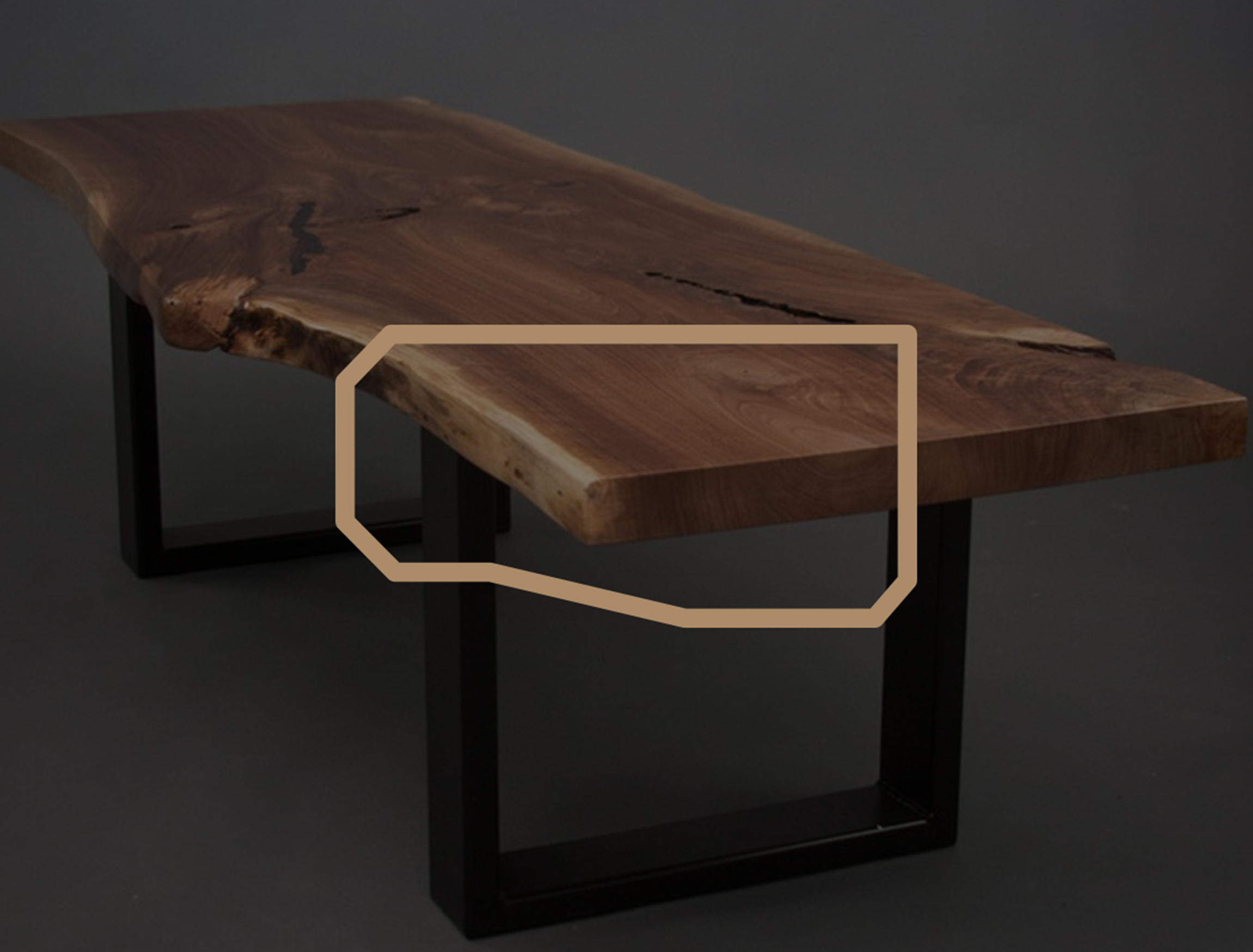
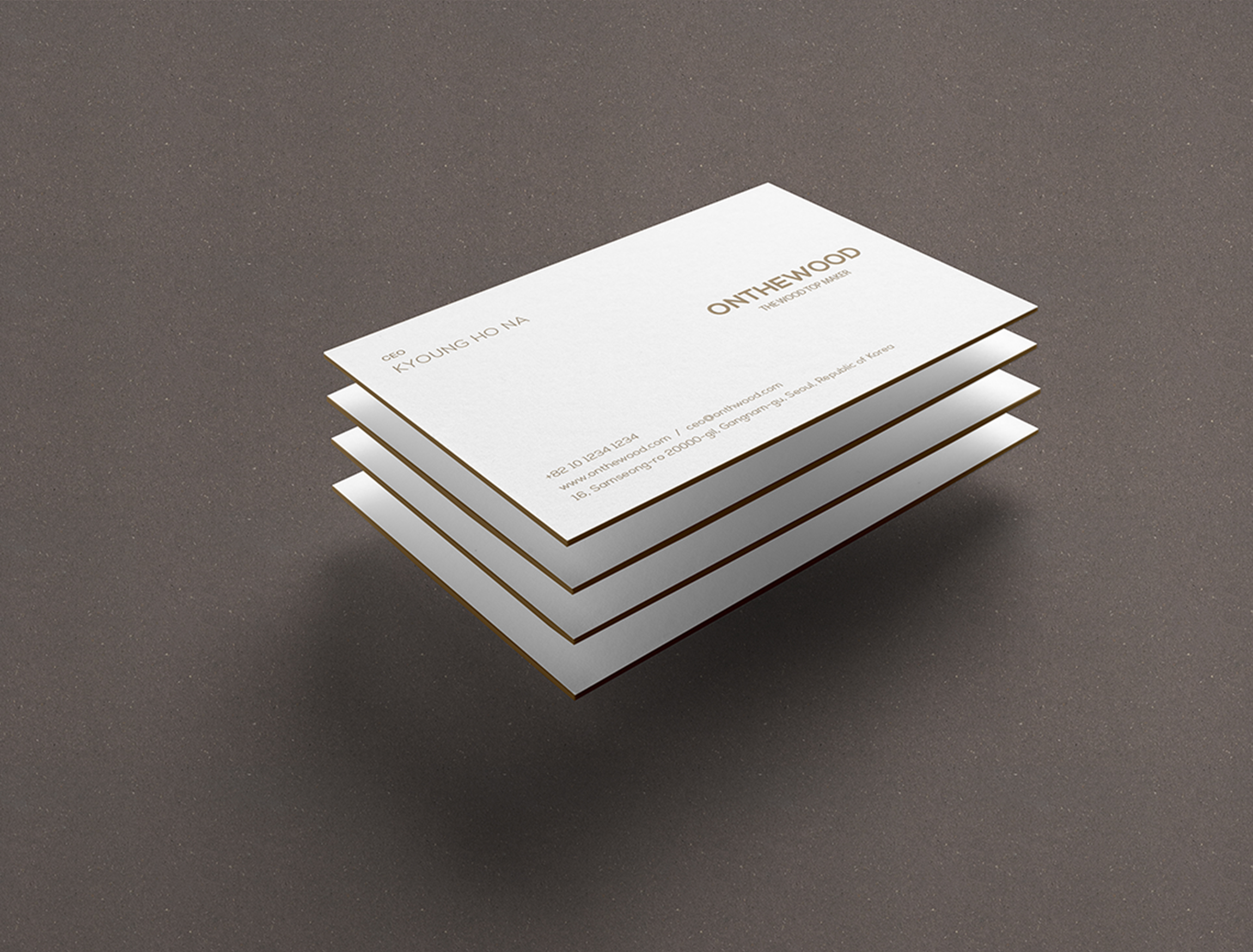
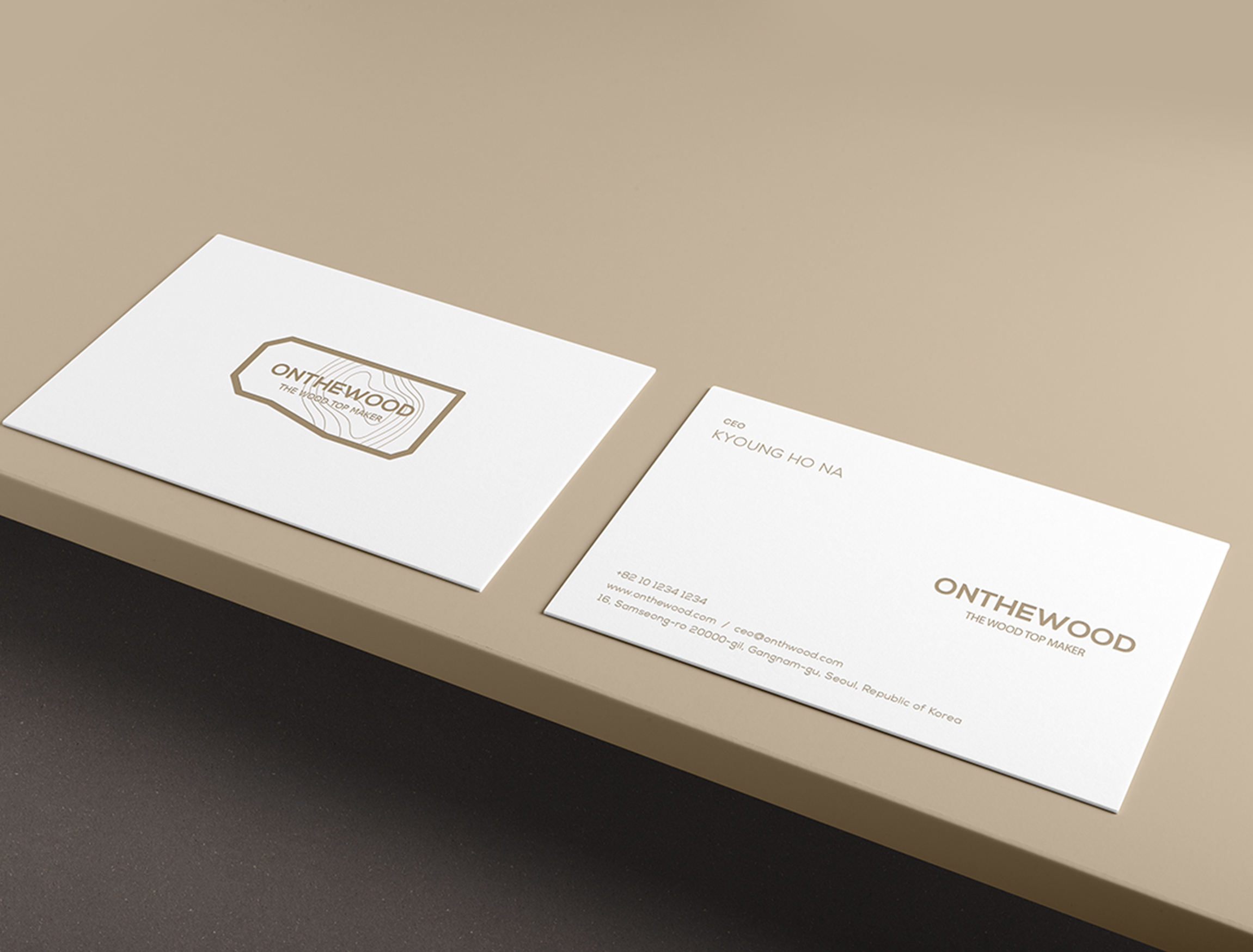
Onderwood is the company where make furniture to deliver its own feeling of tree by using natural hardwood. After searching the shape of natural hardwood tables that Onderwood pursues, it was found that all of them has shape that brought a sense of natural hardwood and neutral feeling with straight and curves. After gathering data, I looked for characteristics common to all table shapes and simplified. The table was produced by using straight and curved feelings together on the geometrical figure that represents the shape of table in order to look like not too difficult but modern.In addition, the characteristic to show the ‘tree’ which is the material of natural hardwood table was ‘growth ring.’ Since I thought geometrical figure has strong straight lines excessively though it should let viewers feel the shape of table, I tried to represent curved feelings in tree growth ring. And I made tree growth ring thinner not to bother typography which is the brand name. Lastly, sans-serif font was used for typography to create modern atmosphere and let viewers can get the view of brand name at a glance so that they could feel the company specialized in natural hardwood table production. It’s available to use typography solely and adjust the size and position of brand name and sub name in order to be trendy. The priority when we came up with Onderwood logo was that we have to make exotic and properly foreign logo since its hardwoods were imported from Europe and north America.
